Diseño de Menú con buscador responsive en HTML + CSS + JS
Autor: J. Luis, 2 diciembre, 2022
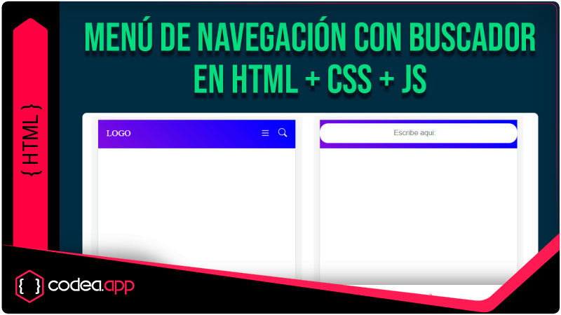
Para diseño un menu de navegación con buscador responsive usaremos html y css para el diseño y Javascript para la interacción con el usuario
Para diseño un menu de navegación con buscador responsive usaremos html y css para el diseño y Javascript para la interacción con el usuario
Contenido
- Versión menú de navegación sin buscador
- Estructura CSS
- Interactividad con Javascript
- Versión del código completo con el buscador responsive
VERSION MENU SIN BUSCADOR
<div class="menu">
        <div class="logo">
            <a href="#">LOGO</a>
        </div>
        <div class="items" id="items">
            <span class="closemenu" onclick="_closeMenu()">x</span>
            <a href="">Item 1</a>
            <a href="">Item 2</a>
            <a href="">Item 3</a>
        </div>
        <div class="hamb" onclick="_openMenu()">
            <span>
                <svg xmlns="http://www.w3.org/2000/svg" width="16" height="16" fill="currentColor" class="bi bi-list" viewBox="0 0 16 16">
                <path fill-rule="evenodd" d="M2.5 12a.5.5 0 0 1 .5-.5h10a.5.5 0 0 1 0 1H3a.5.5 0 0 1-.5-.5zm0-4a.5.5 0 0 1 .5-.5h10a.5.5 0 0 1 0 1H3a.5.5 0 0 1-.5-.5zm0-4a.5.5 0 0 1 .5-.5h10a.5.5 0 0 1 0 1H3a.5.5 0 0 1-.5-.5z"/>
                </svg>
            </span>
        </div>
</div>
ESTRUCTURA CSS
body{
        margin: 0;
    }
    .menu{
        background: linear-gradient(45deg,rgb(107, 20, 220),blue);
        display: flex;
        justify-content: space-between;
        padding: 15px 20px;
    }
    .logo a{
        color: white;
        text-decoration: none;
        font-weight: bolder;
    }
    .items a{
        color: white;
        text-decoration: none;
        padding: 0 20px;
    }
    .closemenu{
        display: none;
        text-align: right;
        padding-right: 20px;
        padding-top: 10px;
        color: white;
    }
    .hamb{
        display: none;
    }
    .menulateral{
        background:  linear-gradient(45deg,rgb(107, 20, 220),blue);
        left: 0 !important;
        z-index: 10;
    }
    @media screen and (max-width:500px){
        .items{
            position: absolute;
            height: 100%;
            width: 100%;
            left: -100%;
            top: 0px;
            transition: .5s;
        }
        .items a{
            display: block;
            padding: 20px !important;
        }
        .closemenu{
            display: block !important;
        }
        .hamb{
            display: block;
            color: white;
        }
    }
INTERACTIVIDAD JAVASCRIPT
function _openMenu(){ items.classList.add('menulateral')}
function _closeMenu(){ items.classList.remove('menulateral')}
VERSIÓN DEL CÓDIGO COMPLETO CON EL BUSCADOR RESPONSIVE
Incluyendo la integración del buscador responsive
<!DOCTYPE html>
<html lang="es">
<head>
    <meta charset="UTF-8">
    <meta http-equiv="X-UA-Compatible" content="IE=edge">
    <meta name="viewport" content="width=device-width, initial-scale=1.0">
    <title>MENU RESPONSIVE CON BUSCADOR</title>
</head>
<body>
    <div class="menu">
        <div class="logo">
            <a href="#">LOGO</a>
        </div>
        <div class="items" id="items">
            <span class="closemenu" onclick="_closeMenu()">x</span>
            <a href="">Item 1</a>
            <a href="">Item 2</a>
            <a href="">Item 3</a>
        </div>
        <div>
            <span class="hamb" onclick="_openMenu()">
                <svg xmlns="http://www.w3.org/2000/svg" width="18" height="18" fill="currentColor" class="bi bi-list" viewBox="0 0 16 16">
                <path fill-rule="evenodd" d="M2.5 12a.5.5 0 0 1 .5-.5h10a.5.5 0 0 1 0 1H3a.5.5 0 0 1-.5-.5zm0-4a.5.5 0 0 1 .5-.5h10a.5.5 0 0 1 0 1H3a.5.5 0 0 1-.5-.5zm0-4a.5.5 0 0 1 .5-.5h10a.5.5 0 0 1 0 1H3a.5.5 0 0 1-.5-.5z"/>
                </svg>
            </span>
            <div class="buscador">
                <input type="search" class="buscador-input" placeholder="Escribe aqui:">
                <span class="buscador-boton"><svg xmlns="http://www.w3.org/2000/svg" width="16" height="16" fill="white" class="bi bi-search" viewBox="0 0 16 16">
                    <path d="M11.742 10.344a6.5 6.5 0 1 0-1.397 1.398h-.001c.03.04.062.078.098.115l3.85 3.85a1 1 0 0 0 1.415-1.414l-3.85-3.85a1.007 1.007 0 0 0-.115-.1zM12 6.5a5.5 5.5 0 1 1-11 0 5.5 5.5 0 0 1 11 0z"/>
                  </svg>
                </span>
            </div>
        </div>

    </div>
<style>
    body{
        margin: 0;
        font-family: Arial, Helvetica, sans-serif;
    }
    .menu{
        background: linear-gradient(45deg,rgb(107, 20, 220),blue);
        display: flex;
        justify-content: space-between;
        padding: 10px 20px;
    }
    .logo{ line-height: 22px;}
    .logo a{
        color: white;
        text-decoration: none;
        font-weight: bolder;
        vertical-align: text-top;
    }
    .items{line-height: 22px;}
    .items a{
        color: white;
        text-decoration: none;
        padding: 0 20px;
    }
    .closemenu{
        display: none;
        text-align: right;
        padding-right: 20px;
        padding-top: 10px;
        color: white;
    }
    .hamb{
        display: none;
        margin-right: 30px;
        padding-top: 3px;
        color: white;
    }
    .menulateral{
        background:  linear-gradient(45deg,rgb(107, 20, 220),blue);
        left: 0 !important;
        z-index: 10;
    }
    /* BUSCADOR*/
    .buscador{ line-height: 43px; }
    .buscador-input{
        border: none;
        outline: 0;
        padding: 0 30px 0 0;
        width: 0;
        position: absolute;
        top: 12px;
        right: 0;
        z-index: 3;
        background-color: transparent;
        color: #333;
        transition: width .5s cubic-bezier(0,.795,0,1);
        cursor: pointer;
    }
    .buscador-input:focus{
        background: white;
        width: 100%;
        cursor: text;
        top: 4px;
        padding: 10px;
        text-align: center;
        border-radius: 15px;
    }
    .buscador-boton{
        width:30px;
        padding:0;
        text-align:center;
        background:0 0;
        position:absolute;
        top:3px;
        right:8px;
        z-index:2;
        cursor:pointer;
    }
    /* FIN BUSCADOR*/
    @media screen and (max-width:500px){
        .items{
            position: absolute;
            height: 100%;
            width: 100%;
            left: -100%;
            top: 0px;
            transition: .5s;
        }
        .items a{
            display: block;
            padding: 20px !important;
        }
        .closemenu{
            display: block !important;
        }
        .hamb{
            display: block;
        }
    }
</style>
<script>
    function _openMenu(){ items.classList.add('menulateral')}
    function _closeMenu(){ items.classList.remove('menulateral')}
</script>
</body>
</html>
Leido 5242 veces | 6 usuarios
Descarga del código fuente
Diseño de Menú con buscador responsive en HTML + CSS + JS
Accede al código fuente esencial de nuestra aplicación en formato ZIP ó TXT. Ideal para desarrolladores que desean personalizar o integrar nuestra solución.
- [ Descargas: 241 ]
CÓDIGO FUENTE: USD 0.00
Conversar con J.Luis